I will be using this template as a model to base my digipak on. It is important to use a template as this will create a more realistic DIGIPAK.
The Review:
What Went Well ?
- The image looks really affective
- The barcode is a common convention of a back cover
- There is a song listing for two discs
- The name of the artist is in a clear bold font which is very eye-catching
What Went Wrong ?
- The colour scheme did not match the rest of my DIGIPAK.
- The font size and type is very hard to read
- I have missed of a price, copyright text and record label
Production Process:
Stage 1: Selecting the image via a
screenshot from my music video
Stage 2: Positioning of the image
Stage 3: Adding effects to the image
Stage 4: Selecting the colour, font style
and font size
Stage 5: Adding the barcode
Stage 6: Adding a name for the artist
Draft 2 :
The Review:
What Went Well ?
- The barcode is a common convention of a back cover
- The record label clearly stands out and looks very effective
- The font is clear and the colour white works well against the dark blue background
- The copyright text appears at the bottom of the cover which is another common feature
What Went Wrong ?
- I think an image would look better rather than a bold background
- There is no price on the back cover
- There is only a song listing for one disc
Production Process:
Stage 1: Selecting a plain background and
selecting the correct colour
Stage 2: Adding the song listing and
changing the font colour, size and shape
Stage 3: Adding a barcode
Stage 4: Adding my own record label
Stage 5: Adding a copyright text
Draft 3a :
The Review:
What Went Well ?
- There is a price which is a common convention of a back cover
- The barcode is a common convention of a back cover
- The record label clearly stands out and looks very effective
- The font is clear
- The image looks really effective and fits in with the rest of my DIGIPAK
- The colour black looks stands out against background
- The copyright text appears at the bottom of the cover which is another common feature
What Went Wrong ?
- The font is harder to read far away
- Not many back covers appear with vertical song listings
- I have noticed a few mistakes such as some songs repeat themselves
Draft 3b :
The Review:
What Went Well ?
- I have added in a website as this keeps the cover modern
- The barcode and price are both common convention of a back cover
- The record label clearly stands out and looks very effective
- The font is clear and the colour white works well against the dark blue background
- I have added more text such a production number to the copyright text at the bottom of my cover
- Two song listings
- I erased the songs which had been repeated
- I added less songs to Disc Two
What Went Wrong ?
- T
he text is still difficult to read from far away
- The vertical song listings don't look very effective
- The Disc 1 text doesn't stand out
Production Process:
Stage 1: Selecting the image from my
music video via a screenshot
Stage 2: Removing the artist from the
background and making the background just of the sea (including blending the
images together)
Stage 3: Adding a title for both discs
Stage 4: Adding two sets of song listings
Stage 5: Adding a barcode
Stage 6: Adding a price and changing the
size and colour of the font
Stage 7: Adding a record label
Stage 8: Adding the copyright text
The Review:
What Went Well ?
- The barcode, price, record label, website and copyright text all work really well as common features on the back cover
- The type of font makes the writing stand out more effectively
- The skinner font and the colour black work well together
What Went Wrong ?
- The titles could stand out if they have a black border around them
Production Process:
Stage 1: Selecting the image from my music video via a screenshot
Stage 2: Removing the artist from the background and making the background just of the sea (including blending the images together)
Stage 3: Adding a title for both discs
Stage 4: Adding two sets of song listings
Stage 5: Adding a barcode and selecting the positioning of the barcode
Stage 6: Adding a price and changing the size and colour of the font to it is readable
Stage 7: Adding a record label
Stage 8: Adding a detailed copyright text
Stage 9: Adding a website
The Review:
What Went Well ?
- The barcode, price, record label, website and copyright text all work really well as common features on the back cover
- The type of font makes the writing stand out more effectively
- The skinner font and the colour black work well together
- The title now has a black outline around them so they can stand out
Production Process:
Stage 1: Selecting the image from my music video via a screenshot
Stage 2: Removing the artist from the background and making the background just of the sea (including blending the images together)
Stage 3: Adding a title for both discs
Stage 4: Adding two sets of song listings and changing the song listings shape
Stage 5: Adding a barcode and selecting the positioning of the barcode
Stage 6: Adding a price and changing the size and colour of the font to it is readable
Stage 7: Adding a record label
Stage 8: Adding a detailed copyright text
Stage 9: Adding a website
Copyright Sign:
I googled the copyright sign as this is a convention of a CD. I have used this on the back of my CD, however at first I inserted an image but realised I needed this sign in a text format. Therefore I cut the sign from a text format instead. This was then inserted into the text which appears at the bottom of my CD.
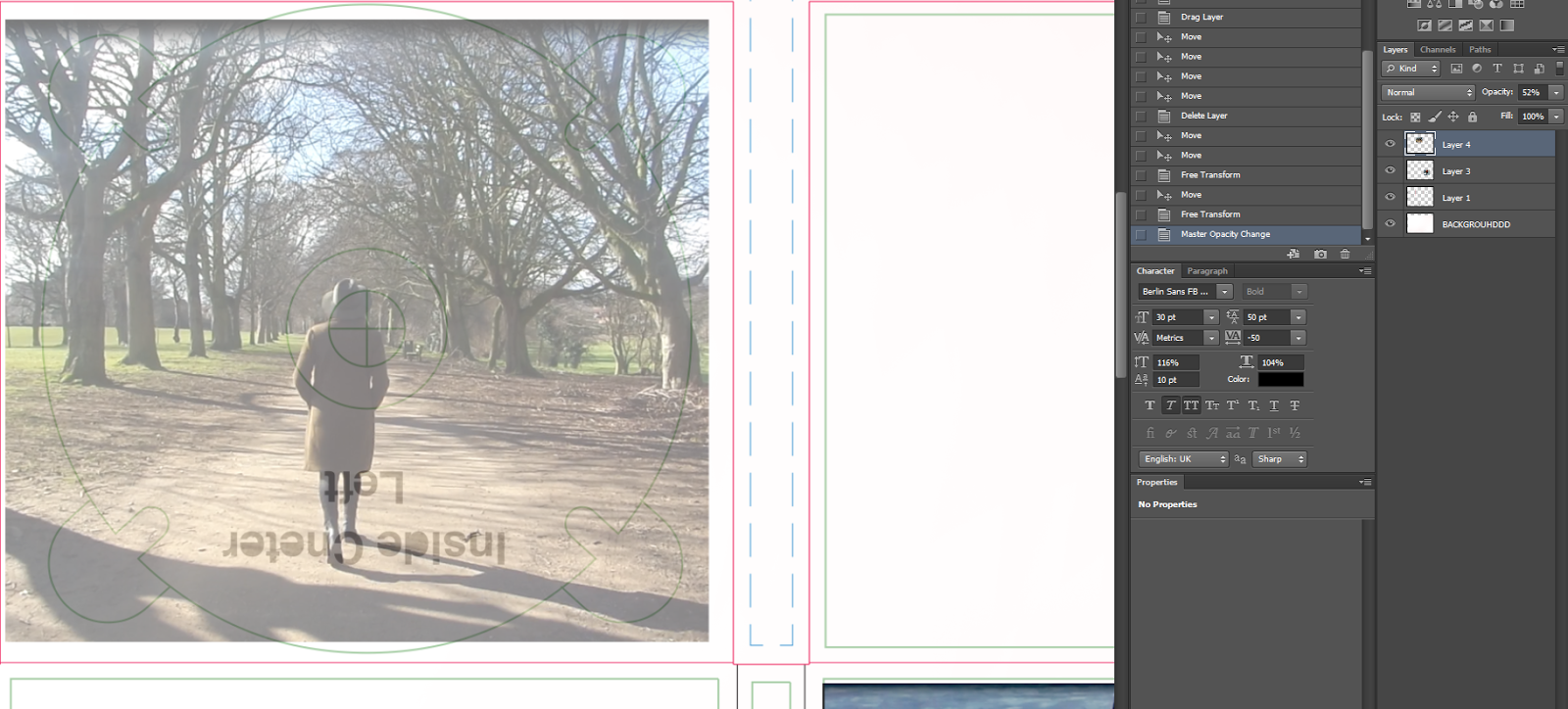
Inside Left and Right Covers
This Prezi shows the process of making the inside covers:
The DVD and CD
Images:
Product and Processing 1:
Adding a background:
Adding the DVD and CD logo:
The Spine
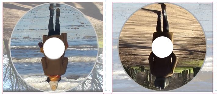
I imported an image of the sea then I used the polygon lasso tool to select the part of the image I needed (the inverse):
I then added the text:
I then added a record label and product number: